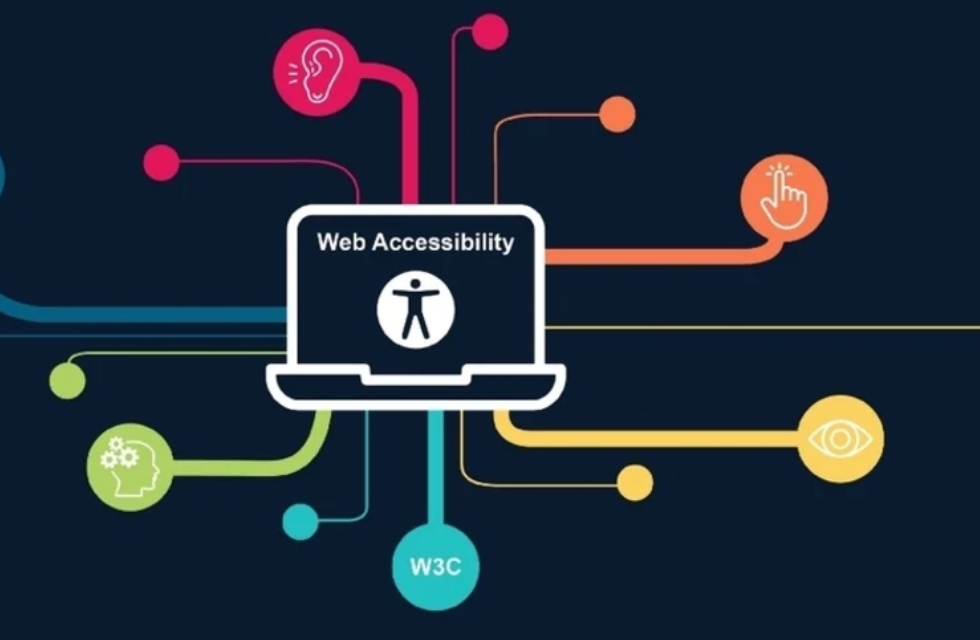
Developing web content that caters to blind and low vision individuals requires a thoughtful and intentional approach. In this guide, we will explore five essential strategies to make websites accessible for this demographic.
1. Incorporate Accessibility from the Start
When embarking on website design, prioritize accessibility considerations from the outset. Craft fictional personas representing diverse user needs and integrate accessibility into the initial design stages. According to Elsa Vane, Accessibility Specialist at Pluralsight, waiting until later in the process to address accessibility can lead to design challenges. Early incorporation ensures a seamless integration into the final design.
2. Utilize Testing Tools for Accessibility
Accessible web design doesn’t have to be overwhelming. Tools like WAVE and Color Oracle simplify the testing process. WAVE identifies elements not meeting accessibility guidelines, including broken ARIA references and contrast issues. Color Oracle, a color blindness simulator, aids in designing for users with color vision deficiencies. Real-world testing with screen readers like NVDA complements these tools for a comprehensive accessibility assessment.
3. Consider the Spectrum of Visibility
Contrary to common belief, not all visually impaired individuals use screen readers. Recognize the spectrum of visibility, as only 15 percent of people with eye disorders are totally blind. Design decisions, such as font size, impact users with various visual abilities. Acknowledge the diversity within this demographic to create a universally inclusive design.
4. Prioritize Accessibility in Information Presentation
Ensure accessibility extends beyond the physical experience to information gathering. Consider both visual and non-visual methods of presenting information. Provide alternatives for visual content and prioritize clarity for users with diverse learning styles and abilities. Address common issues, like missing Alt text for images, which was the second most common WCAG failure type in 2022.
5. Optimize Color Contrast in Text
Low contrast text is a prevalent accessibility issue, affecting the majority of home pages. Prioritize sufficient color contrast to enhance readability for individuals with low vision. Tools like WAVE and WebAIM contrast checker can assist in identifying and adjusting contrast levels to meet WCAG requirements. Designers can enter hex codes to tailor the color scheme for optimal accessibility.
Additional Learning Resources on Accessibility
For a deeper understanding of web accessibility, Pluralsight offers a dedicated learning path titled “Developing Websites for Accessibility.” This path comprises seven highly-rated courses covering testing and evaluating accessibility, exploring design considerations, and providing accessibility for various elements, images, and media.
In conclusion, creating accessible websites for blind and low vision users requires a holistic approach from the initial design stages to thorough testing and ongoing learning.
About the Author: Pritish Kumar Halder
Pritish Kumar Halder is a seasoned web developer and accessibility advocate. With a passion for inclusive design, Pritish has contributed to numerous projects aimed at making the digital space more accessible for all users. Follow Pritish on LinkedIn for insights into web development and accessibility trends.


